
Close
Tips for Matching Feature Wall Paint with Existing Interior Colours
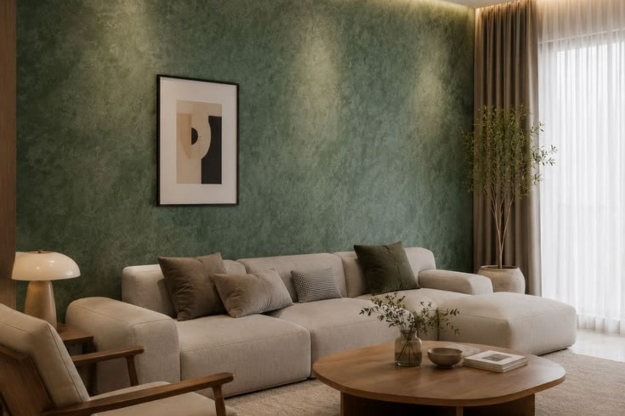
A feature wall is an effective way to add character, depth, and visual interest to a room without changing the entire interior. Whether you prefer bold colors, soft neutrals, or natural shades, the right feature wall paint can complement your existing decor and create a balanced appearance. However, choosing a suitable color requires careful consideration of furniture, flooring, lighting, and other elements in the space.
By understanding basic color coordination and interior design principles, homeowners can select feature wall paint that enhances their living environment. Here are several practical tips to help you achieve a cohesive and attractive interior.
1. Identify Your Existing Interior Colour Palette
Before deciding on a feature wall color, review the main colors in your room, including the walls, furniture, and flooring. Choose a shade that harmonizes with the surrounding elements.
Consider these examples:
- Warm interiors: Beige, cream, brown, and warm wood tones pair well with terracotta, muted green, and warm taupe.
- Cool interiors: Gray, white, and blue accents can work well with navy blue, dusty blue, or soft sage green.
- Neutral interiors: White, beige, and gray provide flexibility for introducing deeper or more vibrant feature wall colors.
Selecting a shade that complements your current color scheme creates a harmonious look without overwhelming the space.
2. Use Furniture as a Colour Reference
Use large furniture pieces, such as sofas, beds, and cabinets, as a reference when choosing feature wall paint. Beige sofas pair well with muted green, while dark wood furniture complements warm white or taupe. For bold furniture, choose softer wall colors to maintain balance.
Consider the following combinations:
- Pair pale wood furnishings with sage green or soft white walls for a natural, balanced look.
- Dark wood furniture with beige, cream, or muted terracotta.
- Gray upholstery with dusty blue or charcoal accents.
- White furniture with navy blue or olive green walls.
Instead of matching every element exactly, choose colors that complement one another. Slight differences in tone can create depth and prevent the interior from appearing overly uniform.
3. Consider the Size and Layout of the Room
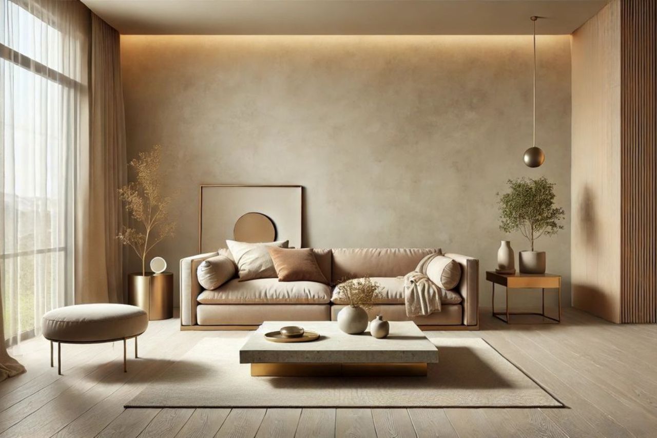
Room size can influence how feature wall paint affects the overall space. Lighter colors generally create a more open appearance, while darker shades can introduce depth and a stronger focal point.
In smaller rooms, soft beige, pale gray, and muted green can add character without making the space feel overwhelming. In larger rooms, deeper colors such as navy blue, forest green, and charcoal may create a more defined and dramatic effect.
The layout also matters. A feature wall should draw attention to an area that naturally deserves focus, such as the wall behind a bed, sofa, fireplace, or dining table.
Before painting, consider the placement of windows, doors, furniture, and decorative elements. Selecting the right wall helps the color feel intentional and supports the overall room design.
4. Match Feature Wall Paint With Flooring
Flooring plays an important role in choosing feature wall paint. Warm wooden floors pair well with cream, terracotta, and olive green, while gray-toned flooring complements dusty blue, soft gray, or muted green. For patterned or colorful tiles, choose simpler wall shades to maintain a balanced interior.
A few practical combinations include:
- Light oak flooring with sage green or beige walls.
- Dark wood flooring with cream or warm gray walls.
- Gray tiles with dusty blue or soft charcoal.
- Beige tiles with terracotta or warm taupe.
These combinations can help create visual harmony between the floor and the wall without requiring identical colors.
5. Pay Attention to Natural and Artificial Lighting
Lighting can significantly affect how feature wall paint appears. Rooms with plenty of natural light can suit deeper shades, while darker spaces may benefit from lighter colors. Warm lighting highlights yellow and brown undertones, whereas cool lighting can emphasize blue and gray tones.
To choose the right color:
- Test paint samples directly on the intended wall.
- Observe the samples at different times of day.
- Check their appearance under your regular indoor lighting.
- Compare the samples with furniture, flooring, and curtains.
Testing colors before painting helps reduce the risk of choosing a shade that clashes with the existing interior.
6. Apply the 60-30-10 Colour Rule
The 60-30-10 rule is a useful guideline for creating a balanced interior color scheme. It divides the room’s colors into three proportions, helping prevent one shade from dominating the entire space.
The general approach is:
- 60% dominant color: Usually the main wall color or another large surface.
- 30% secondary color: Often used for furniture, curtains, or larger decorative elements.
- 10% accent color: Introduced through accessories, artwork, cushions, or smaller details.
A room might feature warm white as the dominant color, beige as the secondary color, and olive green as the accent. Alternatively, a navy blue feature wall can provide the accent against lighter surrounding walls and neutral furniture.
These proportions are flexible rather than strict rules. The goal is to create a visually balanced interior in which the feature wall complements the rest of the room.
7. Choose Colours That Match Your Interior Style
Choose feature wall colors that complement your home's overall design style.
- Modern interiors: Charcoal, navy blue, muted gray, and warm white create a clean, contemporary appearance.
- Minimalist interiors: Beige, cream, soft gray, and muted earth tones maintain a simple and uncluttered look.
- Scandinavian interiors: Sage green, dusty blue, warm white, and light neutral shades complement natural materials and simple furniture.
- Rustic interiors: Terracotta, olive green, warm brown, and clay-inspired colors work well with wood and textured finishes.
- Traditional interiors: Deep green, burgundy, navy blue, and warm taupe can complement classic furniture and decorative details.
Selecting a color that suits your preferred style helps the feature wall feel like a natural part of the room.
8. Test Paint Samples Before Making a Final Decision
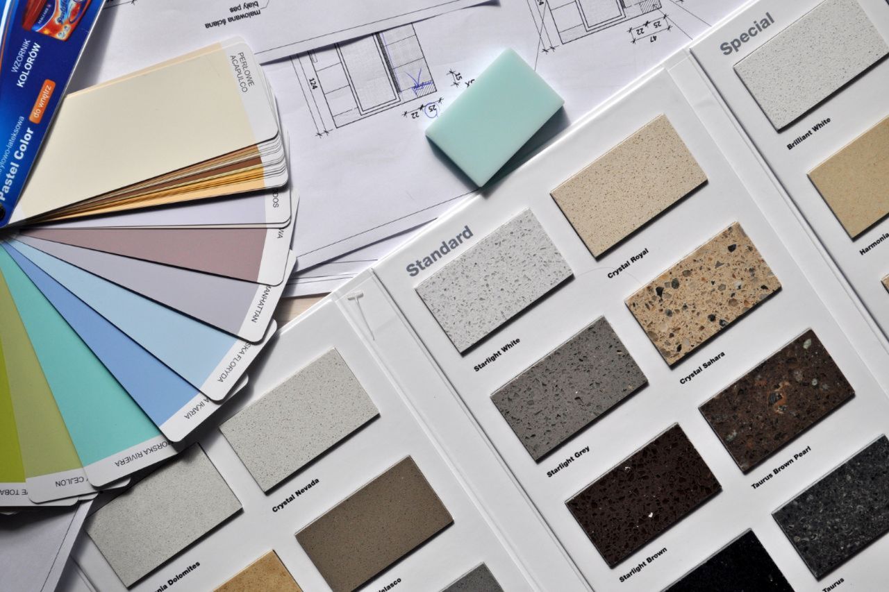
Testing paint samples helps prevent color-matching mistakes because shades can look different depending on lighting, wall texture, and surrounding colors.
Apply samples to the intended wall and let them dry according to the manufacturer's instructions. Compare several shades under different lighting conditions and alongside your furniture and flooring.
Also, consider the paint finish. Matte finishes create a soft appearance, while satin finishes offer more sheen. Choose one that suits your desired style and the room's practical needs.
Conclusion
Matching feature wall paint with existing interior colours requires careful attention to furniture, flooring, lighting, room size, and personal style. By identifying your current color palette and selecting complementary shades, you can create a feature wall that enhances the space without disrupting its overall design.
Use paint samples to evaluate colors in your actual environment, and consider guidelines such as the 60-30-10 rule to maintain balance. With thoughtful planning, the right feature wall paint can add depth, character, and visual interest while keeping your interior cohesive and inviting.