
Close
How to Match Colors in House Renovation with Your Interior Style

Choosing the right colors in house renovation can transform your space, as walls, furniture, flooring, cabinets, and decor all influence its overall look and feel. A well-matched palette can make a room feel spacious, comfortable, and welcoming.
Rather than following trends alone, consider your interior style, room size, lighting, and existing features when selecting colors. Whether you prefer minimalist, modern, Scandinavian, traditional, industrial, or contemporary design, a coordinated color scheme can bring your renovation together.
Identify Your Interior Style
Start by deciding what type of interior you want. Your preferred style can guide your color choices and make it easier to narrow down options.
Common interior styles include:
- Minimalist: White, beige, gray, and other neutral shades.
- Modern: Neutral colors with strong contrasting accents.
- Scandinavian: White, light gray, beige, soft blue, and natural tones.
- Industrial: Charcoal, black, gray, brown, and earthy shades.
- Traditional: Cream, warm beige, brown, muted green, and classic colors.
- Contemporary: Neutral backgrounds with carefully selected bold accents.
- Coastal: White, light blue, sandy beige, and soft green.
Your color palette should support the style rather than compete with it.
Follow the 60-30-10 Rule
The 60-30-10 rule helps create a balanced color scheme by using a dominant shade for 60%, a secondary color for 30%, and an accent color for 10%.
- 60%: Main wall or background color, such as warm white.
- 30%: Secondary shades through flooring or furniture, such as light brown.
- 10%: Accent colors through decor, artwork, or cushions, such as dark green.
The proportions do not need to be exact; the goal is to keep the colors visually balanced.
Consider Room Size
Room size should also influence your color selection. Light colors can make smaller spaces feel more open and brighter, while darker colors can add depth and make larger rooms feel more comfortable.
For smaller rooms, consider:
- White and off-white
- Light beige
- Pale gray
- Soft blue
- Light green
- Warm neutral shades
Larger rooms give you more freedom to use deeper shades such as navy, charcoal, forest green, terracotta, or brown. If you use dark colors, balance them with good lighting and lighter furniture or decorative elements.
Think About Lighting
Lighting can affect how paint colors appear throughout the day. Test a sample on the wall and check it under natural daylight and artificial lighting before making your final choice.
This is especially useful for rooms such as:
- Living rooms
- Bedrooms
- Kitchens
- Dining areas
- Home offices
- Hallways
Testing samples helps you understand the actual color before committing to the entire renovation.
Match New Colors With Existing Features
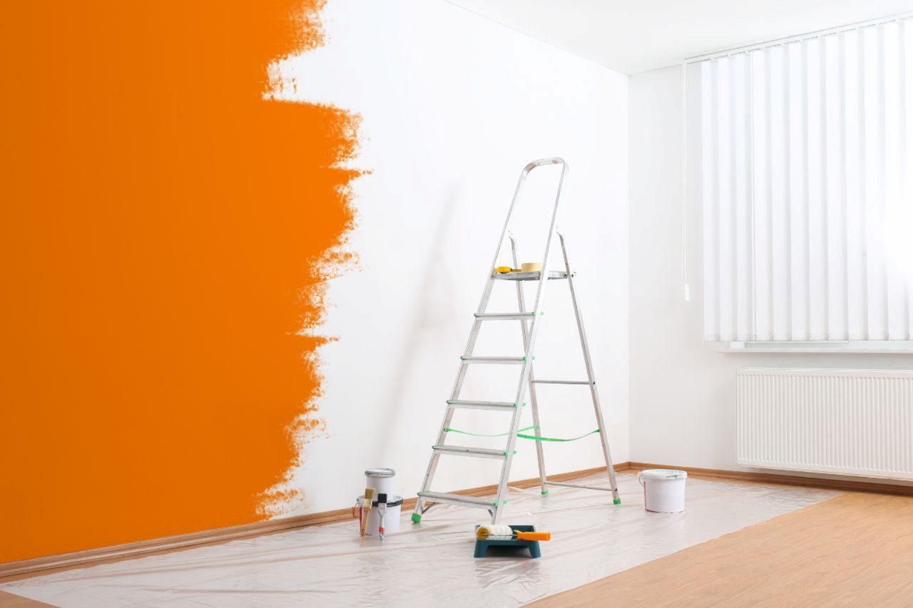
You do not need to replace everything during a renovation. If you are keeping existing flooring, furniture, cabinets, or fixtures, choose colors that complement them.
- Warm wood flooring: Pair with cream, warm white, beige, olive green, or muted terracotta.
- Cool gray flooring: Works well with white, blue, charcoal, or cool neutrals.
- Existing furniture and tiles: Consider the dominant colors and undertones of existing elements when choosing your new paint.
The goal is to create a natural connection between different elements rather than making everything the same color.
Pay Attention to Undertones
Undertones can make a major difference when combining colors. Two shades may appear similar but have different warm or cool undertones. Warm colors include:
- Cream
- Beige
- Warm white
- Terracotta
- Warm brown
- Soft yellow
Cool colors include:
- Blue
- Cool white
- Blue-gray
- Green-gray
- Sage
When combining warm and cool colors, make sure the contrast looks intentional. Otherwise, the different undertones may make the room appear unbalanced.
Create Color Flow Between Rooms
Different rooms can have their own colors while still maintaining a consistent look. Use one main neutral throughout the home and add different accent shades to individual spaces.
- Main areas: Warm white or another neutral as a common base.
- Bedroom: Add muted blue for a calm touch.
- Kitchen: Use sage green as an accent.
This creates visual continuity while allowing each room to have its own character.
Use Accent Colors Carefully
Accent colors are useful for adding personality. You can introduce a stronger shade through an accent wall, cabinet, furniture piece, artwork, or accessories.
Popular accent choices include:
- Deep blue
- Emerald green
- Terracotta
- Burgundy
- Charcoal
- Mustard yellow
Avoid using too many strong colors in one room. Choose one main accent shade and repeat it through smaller details for a more coordinated look.
For example, a dark green accent wall can be complemented with green cushions, artwork, plants, or decorative items.
Choose Colors Based on the Room's Purpose
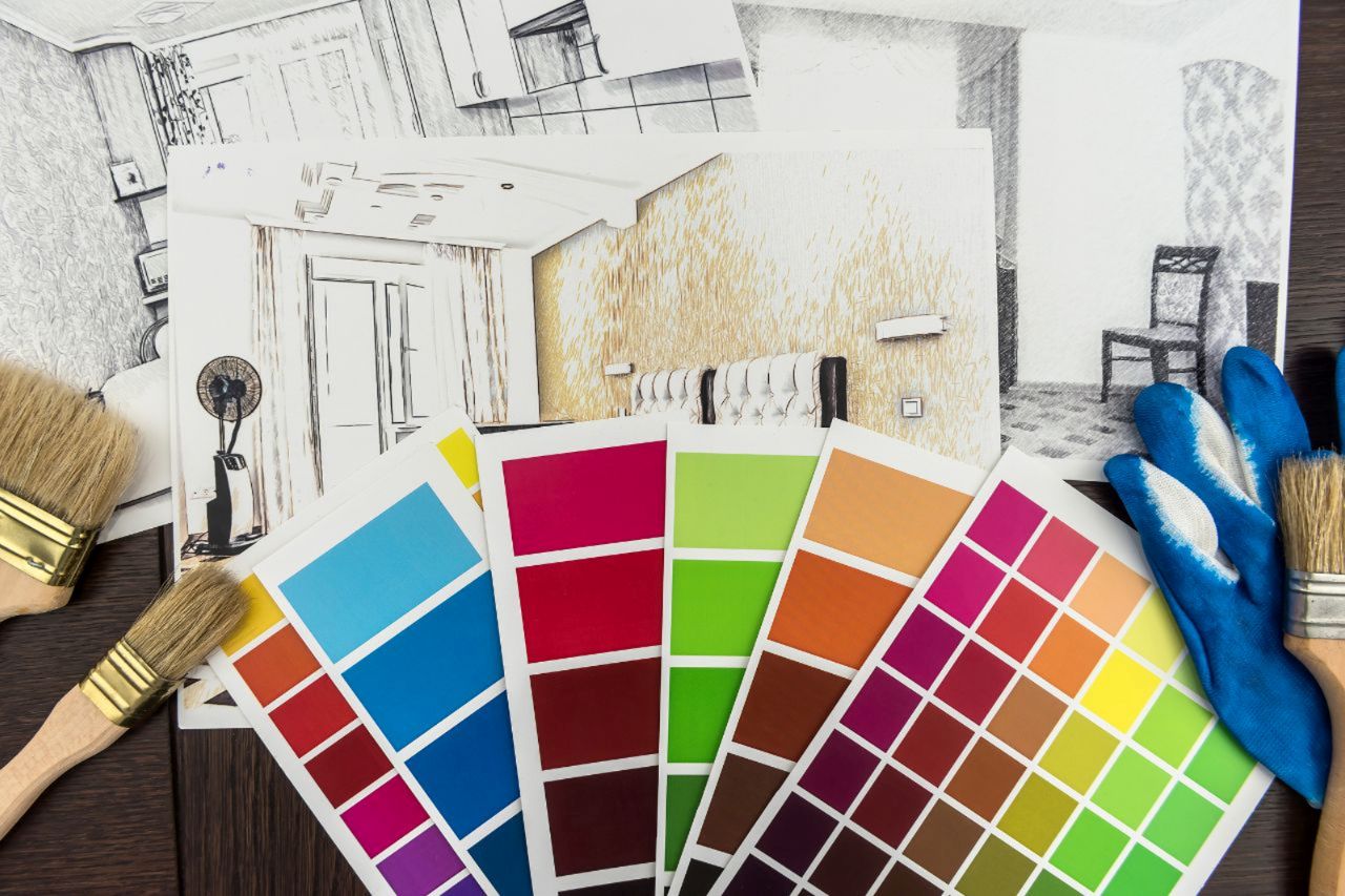
Consider how you want each room to feel and function before choosing its colors. Choose shades that complement the room’s purpose while reflecting your personal style and preferences.
- Bedrooms: Soft neutrals, muted greens, and gentle blues for a calm feel.
- Living rooms: Warm beige, cream, earthy tones, or balanced neutrals for a welcoming atmosphere.
- Kitchens: White, gray, blue, green, or warm neutrals to complement cabinets and finishes.
- Home offices: Neutral or muted shades for a comfortable, focused environment.
Coordinate Colors With Furniture
Choose paint colors together with your furniture and decor to create a balanced interior. Bright or patterned furniture often works well with neutral walls, while neutral furniture gives you more freedom to use stronger wall colors.
- Collect samples of flooring, curtains, upholstery, tiles, and other major materials.
- Place the samples together to check how the colors and undertones work.
- Consider consulting a reliable paint supplier in Malaysia for advice on shades, finishes, coverage, and suitable paint types for different surfaces.
Avoid Using Too Many Colors
Using too many colors can make a home feel visually confusing. Instead, create a small palette of complementary shades and use them throughout the property.
A simple palette might include:
- One dominant neutral
- One secondary color
- One or two accent shades
You can change the intensity of these colors between rooms while maintaining a consistent overall appearance.
Think About Long-Term Appeal
Trendy colors can refresh your home, but renovation colors should remain practical over time. Use bold or fashionable shades in easily replaceable decor, while choosing timeless colors for permanent features.
- Easy-to-change items: Cushions, rugs, artwork, curtains, and accessories.
- Permanent features: Walls, cabinets, flooring, and other large surfaces.
Tip: Choose shades you will feel comfortable with even as your furniture and preferences change.
Conclusion
Matching colors with your interior style are about creating balance and consistency rather than making every room look identical. Start with your preferred style, then consider room size, lighting, existing materials, undertones, furniture, and the atmosphere you want to create.
A carefully planned color palette can make your house renovation feel completer and more cohesive. By testing colors before painting, limiting your main palette, and using accent shades thoughtfully, you can create an interior that reflects your style while remaining comfortable and practical for everyday living.