
Close
Common Paint Colors for Homes That Increase Visual Appeal
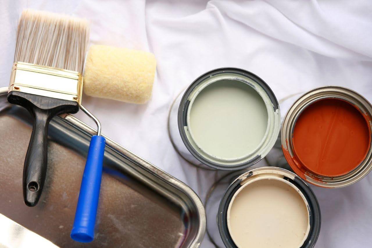
Choosing the right paint color is one of the simplest ways to enhance a home's appearance. Whether updating a single room or repainting the entire house, the right shades can make spaces feel brighter, larger, warmer, and more inviting while adding to the home's overall visual appeal.
With so many options available, choosing the best color can be challenging. However, timeless paint colors remain popular because they complement a wide range of interior styles and create a stylish, welcoming atmosphere. This guide explores common paint colors for homes that can improve both aesthetics and everyday living.
Why Paint Color Matters
Paint is more than just decoration. It influences how people perceive a room and how comfortable they feel inside it.
The right paint color can:
- Make small rooms appear larger.
- Brighten dark spaces.
- Create a relaxing atmosphere.
- Improve natural lighting.
- Highlight architectural features.
- Complement furniture and decorations.
- Increase overall property appeal.
Selecting suitable colors also ensures that your home maintains a balanced and harmonious appearance throughout different living spaces.
1. White - A Timeless Classic
White remains one of the most popular choices for homes because of its clean and elegant appearance.
Benefits of White Paint:
- Makes rooms appear larger.
- Reflects natural light effectively.
- Matches nearly every furniture style.
- Creates a fresh and modern atmosphere.
- Works well in both traditional and contemporary homes.
White is commonly used in:
- Living rooms
- Kitchens
- Bedrooms
- Bathrooms
- Hallways
- Home offices
Homeowners can choose from warm whites, cool whites, or soft ivory shades depending on the desired ambiance.
2. Light Gray – Modern and Sophisticated
Gray has become a favorite among homeowners seeking a modern yet versatile interior. Unlike darker grays, light gray creates a balanced and calming environment while allowing colorful furniture and artwork to stand out.
Advantages:
- Neutral and easy to match
- Suitable for minimalist designs
- Creates elegant interiors
- Hides minor wall imperfections
- Works with both warm and cool accents
Light gray pairs beautifully with:
- White trim
- Black fixtures
- Wooden furniture
- Marble countertops
- Metallic decorations
3. Beige – Warm and Welcoming
Beige remains a popular home paint color because it adds warmth and comfort while maintaining a balanced, elegant look. Its natural tone blends easily with various decorating styles.
Best Areas:
- Family rooms
- Dining rooms
- Bedrooms
- Entryways
Beige complements materials such as:
- Natural wood
- Stone
- Leather furniture
- Linen fabrics
This timeless color provides comfort while maintaining an elegant appearance.
4. Soft Greige – The Perfect Blend
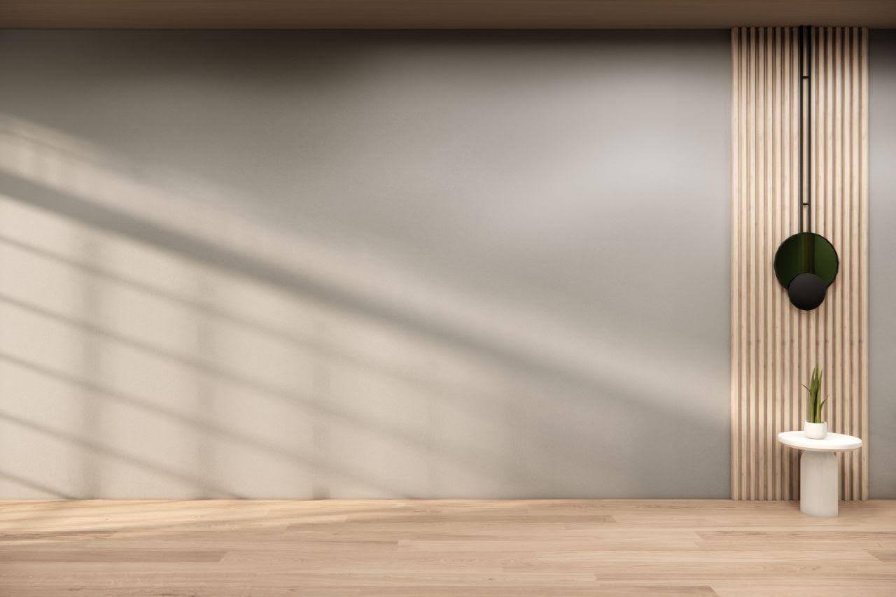
Greige combines gray and beige to create a highly adaptable neutral color. This balanced tone has become increasingly popular because it works well under different lighting conditions.
Why Homeowners Love Greige:
- Modern yet cozy
- Matches almost any décor
- Suitable for open-concept homes
- Creates seamless transitions between rooms
- Offers timeless appeal
Greige works exceptionally well with white ceilings and darker flooring.
5. Light Blue – Calm and Refreshing
Blue is often associated with peace, relaxation, and tranquility. Soft blue shades make rooms feel airy and comfortable without becoming too bold.
Ideal Spaces:
- Bedrooms
- Bathrooms
- Guest rooms
- Reading corners
Benefits include:
- Creates a soothing atmosphere
- Enhances natural light
- Makes rooms feel more spacious
- Pairs well with white furniture
Soft blue remains a favorite for homeowners seeking peaceful interiors.
6. Sage Green – Nature Indoors
Green has gained popularity as homeowners embrace nature-inspired interiors. Sage green offers a subtle earthy tone that feels both relaxing and sophisticated.
Popular Applications:
- Living rooms
- Bedrooms
- Kitchens
- Home offices
It works beautifully alongside:
- Wooden furniture
- Indoor plants
- White cabinetry
- Brass fixtures
- Natural textiles
Sage green creates a refreshing environment while maintaining understated elegance.
7. Warm Cream – Soft and Inviting
Cream offers the brightness of white while adding warmth to the room. Unlike pure white, cream creates a cozy atmosphere that's ideal for family living spaces.
Advantages:
- Soft appearance
- Comfortable ambiance
- Complements traditional interiors
- Easy to coordinate with wood finishes
- Reflects natural light gently
Cream is particularly suitable for homes with limited natural sunlight.
8. Taupe – Elegant Neutral
Taupe combines brown and gray tones to create a refined, luxurious appearance. This versatile color has become increasingly popular in modern homes.
Perfect For:
- Master bedrooms
- Living rooms
- Dining rooms
- Home libraries
Taupe provides warmth while maintaining sophistication.
9. Soft Yellow – Bright and Cheerful
Muted yellow tones add warmth and energy without becoming overwhelming. Unlike bright yellow, soft buttery shades create welcoming environments.
Common Uses:
- Breakfast areas
- Kitchens
- Hallways
- Children's rooms
Benefits include:
- Creates positive energy
- Enhances daylight
- Makes interiors feel welcoming
- Complements white trim
10. Charcoal Accent Walls
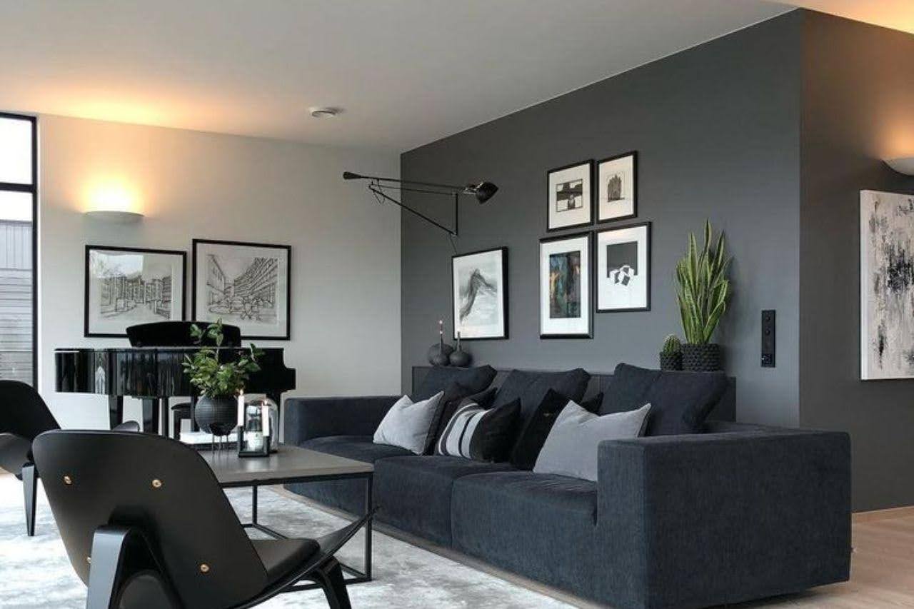
Although neutral colors dominate most walls, darker shades are increasingly used as feature walls. Charcoal gray adds depth and creates visual contrast.
Best Accent Wall Locations:
- Behind television units
- Fireplace walls
- Bedroom headboards
- Dining areas
- Home offices
Accent walls provide character without making rooms appear too dark.
Choosing Colors Based on Room Size
Different colors affect how large or small a room appears.
Small Rooms
Choose lighter colors such as:
- White
- Cream
- Soft gray
- Pale blue
- Light beige
These shades reflect more light, creating a brighter and more spacious feel.
Large Rooms
Larger rooms can comfortably accommodate:
- Dark gray
- Deep blue
- Olive green
- Taupe
- Rich beige
These colors create warmth while reducing the feeling of emptiness.
Tips for Choosing the Right Paint Colors
Before purchasing paint, consider several practical factors.
Evaluate Existing Furniture
Choose colors that complement:
- Sofas
- Curtains
- Flooring
- Cabinets
- Decorative accessories
Test Paint Samples
Paint small sections of the wall and observe them during:
- Morning
- Afternoon
- Evening
- Artificial lighting
Maintain Consistency
For open-concept homes, use complementary colors that transition smoothly from one room to another.
Consider Long-Term Appeal
Neutral colors often remain attractive for many years and are less likely to go out of style.
Benefits of Professional Paint Consultation
While selecting paint colors may seem straightforward, professional guidance can simplify the process.
Experienced paint specialists can help:
- Recommend suitable color combinations.
- Suggest finishes for different rooms.
- Estimate paint quantities accurately.
- Ensure color consistency throughout the home.
- Recommend paints suitable for local climate conditions.
Professional advice can reduce costly mistakes and help homeowners achieve their desired appearance more efficiently.
Final Thoughts
Selecting the right paint colors is one of the most effective ways to improve a home's visual appeal. Popular choices such as white, gray, beige, greige, sage green, cream, and soft blue continue to stand the test of time because they create comfortable, elegant, and versatile living spaces.
When selecting from the numerous common paint colors for homes, homeowners should consider the room size, lighting, furniture, and their personal style. Testing paint samples before making a final decision can help ensure the chosen colors perform well under different lighting conditions.
By combining timeless color palettes with quality paint products and proper application techniques, homeowners can create beautiful interiors that remain stylish for years while enhancing comfort, functionality, and overall property value.